Blog
Blue Nuance Panic: Office LEDs vs Daylight by the Thames
The same sapphire can stop you in your tracks by the Thames and look ordinary under the office ceiling. This difference isn’t magic. It’s physics, optics, and the way gems, metals and human eyes respond to light. I’ll explain the key reasons for the shift—color temperature, spectral power distribution, fluorescence and metamerism—and give practical steps you can take when buying, photographing, or judging blue jewelry in two very different settings: an LED-lit office and daylight next to the river.
Why office LEDs and daylight by the Thames make blues look different
Color temperature (CCT) describes whether a light looks warm or cool and is measured in kelvin (K). Typical office LEDs run from about 3000K to 5000K. Natural daylight at midday approximates 6500K (D65). Cooler light (higher K) boosts short wavelengths—blue and violet—so blues read as more saturated. Warmer light mutes blue and enriches reds and yellows.
Spectral power distribution (SPD) is the full fingerprint of a light source. Two lights with the same CCT can look very different because one may spike strongly in the blue band while another provides a smooth continuum. Many cheap LEDs have narrow peaks near 450 nm; that spike can make a sapphire’s facets bounce intense blue highlights that weren’t visible in broad-spectrum daylight. That’s why CCT alone doesn’t tell the whole story.
Fluorescence and UV content: some blue gems—especially certain sapphires and topazes—show fluorescence under ultraviolet. Daylight contains UV; most office LEDs have little to none. A stone that glows light blue by the river may lose that glow in the office, changing perceived hue and saturation.
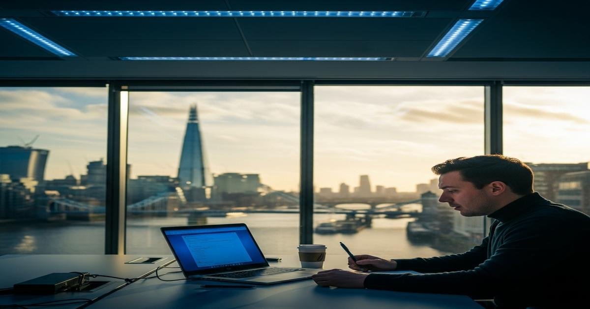
Reflections and environment: the Thames adds blue-green reflections from water and sky. Metallic settings mirror their light source. Rhodium-plated white gold, for example, reflects whatever light color it receives, so a white setting will read cooler under a blue-rich LED and warmer under evening sunlight.
Gem-specific reactions you should expect
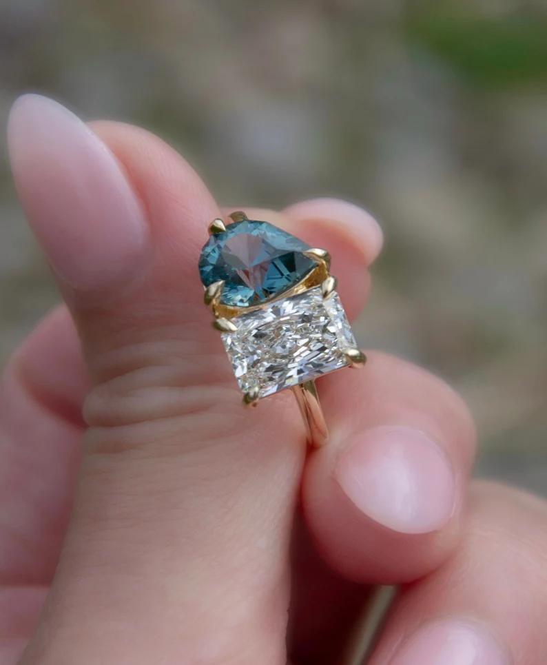
- Sapphires (corundum): often pleochroic—different colors when viewed along different crystal axes. Under neutral daylight you’ll see a balance of blue and violet. Under blue-peaked LEDs the violet component can be suppressed or enhanced, changing the perceived tone. Also, fluorescence can make lower-color stones look brighter in daylight.
- Aquamarine: pale, low-saturation blue. It loses presence in warm light and reads truer in cool, high-CRI daylight. Expect it to appear greener at some times and more icy-blue at others.
- London blue topaz: highly saturated and typically stable across light sources because much of its apparent color is from absorption bands in the visible. But under strong blue LEDs it can look deeper and slightly less reflective because highlights blend with bodycolor.
- Pearls and treated gems: pearls rely on soft, broad-spectrum light to show orient. Under narrow-band LED you can lose the subtle overtones that make a pearl look lively.
Metamerism: the real cause of “panic”
Metamerism means two items match under one light but not another. A blue dress and a sapphire might look identical in your office lamp but very different by the river. Gems are particularly prone because their color comes from selective absorption/fluorescence. If you buy based on only one viewing condition, you accept the risk that the match will fail elsewhere. That’s why gem labs grade under controlled, daylight-equivalent lighting.
Practical steps for buyers and designers
- Always view stones in at least two lights: a daylight-equivalent source (D65, around 6500K) and the typical indoor light where you’ll wear the piece. This shows how the stone adapts to both environments.
- Ask for SPD or CRI info: a light with CRI ≥ 90 renders colors more faithfully. If a seller can tell you the CCT and CRI of their display lights, you’ll understand how representative the view is.
- Use a neutral gray card when photographing: this helps correct white balance so images show a more reliable color across lighting conditions.
- Request a D65 lightbox image: reputable sellers and labs can provide photos under a standard daylight simulator. That’s the reference most gemologists use.
- Note fluorescence and any treatments: ask whether the gem is treated and whether it fluoresces. Labs include this on reports and it explains many day/night shifts.
- Compare settings: place blue gems next to different metals. Yellow gold will warm a blue slightly; platinum or rhodium white will reflect more neutral or cool light.
- Try a quick field test: view the piece, then step outside into daylight for 30–60 seconds, then look back. Your visual adaptation will reveal shifts you might miss with only brief glances.
Advice for retailers and studio lighting
If you sell blue gems, design lighting with two aims: accurate color rendering and attractive sparkle. Use a mix of a broad-spectrum, high-CRI daylight-balanced source (around 5000–6500K) for true hue assessment and warmer accent spots (3000–3500K) to bring out fire and warmth in metal. Avoid narrow-band LEDs as your only light. Also, label display cases with the lighting specs so customers know the viewing conditions.
A quick checklist before you buy or photograph blue jewelry
- View under a daylight-equivalent source (D65) and under the light where you’ll wear it.
- Check for fluorescence and pleochroism on the gem report.
- Ask for CRI and CCT of display lighting; prefer CRI ≥ 90.
- Compare the stone against a neutral gray background and different metals.
- Get detailed measurements: carat weight, mm dimensions, cut style, and the lab report.
- If possible, photograph with a gray card and request a D65 image.
Blue nuance panic is understandable. Light changes everything. But once you know what to look for—CCT, SPD, fluorescence and metamerism—you can judge a gem on its real merits. View consistently, ask for the right information, and you’ll avoid surprises whether you’re under office LEDs or admiring reflections by the Thames.